
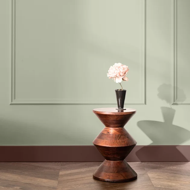
Dulux Picks Soulful Sage as 2027 Colour of the Year for a Calmer Home
Paint manufacturer Dulux has officially announced Soulful Sage as its Colour of the Year for 2027, selecting a soft, silvery green that the company says is designed to make interior spaces feel lighter and brighter. The announcement, made on September 8, 2026, by parent company AkzoNobel, follows a year of research into global social trends and consumer preferences.
Soulful Sage is described as an ethereal, greyed-off mid-tone that sits between traditional green and neutral shades like grey or beige. According to Heleen van Gent, creative director of AkzoNobel's Global Aesthetic Centre, the colour was chosen to address a widespread feeling of being "weighed down by world events and overloaded with information." The shade, she says, offers consumers a practical way to "create a lighter environment so they can feel that weight lifted off their shoulders."
The colour replaces last year's choice, a trio of blue shades called Rhythm of Blues, and arrives as the paint industry continues to use annual colour forecasts to respond to broader societal moods. Van Gent emphasised that Soulful Sage is not just a trend pick but a response to tangible consumer needs: "Our 2027 Colour of the Year is all about creating lighter spaces for a lighter life," she said in the official release.
The announcement positions Soulful Sage as a versatile tone that can function as a neutral backdrop or as a statement colour. It is built on sage green’s long-standing associations with nature, wellbeing and renewal, blending these qualities with a silvery finish that reflects natural light. This, according to AkzoNobel’s colour team, makes it adaptable to different rooms and times of day, subtly shifting in hue from morning to evening.
Why Sage Green Matters Now: The Psychology Behind the Shade
Sage green has been a recurring favourite in interiors for years, but its elevation to Colour of the Year for 2027 carries distinct psychological weight. AkzoNobel’s research, conducted through its annual ColourFutures programme, indicates that consumers are increasingly looking to their homes as sanctuaries from external pressures—ranging from geopolitical instability to the constant buzz of digital information. The choice of a muted green, rather than a bold or energising hue, signals a shift toward restorative design.
The colour’s connection to the sage plant itself plays a large role in its appeal. Sage, a member of the mint family, has traditionally been valued for its restorative and cleansing properties—both physically and symbolically. By naming the colour "Soulful Sage," Dulux taps into these sensory associations: the scent of the herb, the visual calm of a healing garden, and the idea of renewal. "Bringing its wealth of positive associations, sage—and its colour family—can make a home feel warm, healing and ethereal," say the colour experts at the Global Aesthetic Centre.
Green is also notably the easiest colour for the human eye to process, a physiological fact that reinforces its calming effect. Universally linked with the outdoors, sustainability and growth, green carries almost exclusively positive connotations: freshness, innocence and vitality. In a design landscape that has swung between stark minimalism and maximalist expression, Soulful Sage offers a middle ground—a colour that feels contemporary yet timeless, sophisticated yet approachable.
The announcement reflects a broader trend among paint brands to align colour choices with mental health and wellbeing. Pantone’s 2027 pick, Cloud Dancer, a greyish white, similarly leans into neutrality and calm. Dulux’s choice goes a step further by adding a chromatic layer that connects directly to nature, suggesting that consumers do not want to retreat into blankness but rather into environments that actively promote feelings of balance and clarity.
A Shift Away from Bold Statements
The move away from more assertive colours—like the deep blues of 2026—towards a soft, silvery sage also marks a strategic pivot for Dulux. While blues were chosen to evoke trust and stability, Soulful Sage prioritises adaptability and warmth. It implies that homeowners are less interested in making dramatic statements and more focused on creating flexible backdrops for daily life, where elements like natural light and handcrafted furniture can take centre stage.
This shift is not arbitrary. AkzoNobel’s ColourFutures research involves a year of socio-cultural analysis, drawing on data from design, technology and economics to predict not just what colours will be popular, but how and why people will use them in their living spaces. For 2027, the underlying narrative is one of tension relief. As one company statement explains, "In challenging times, creating spaces that sustain and inspire becomes essential. Soulful Sage is designed to serve as a flexible foundation for varying design needs, whether you seek warmth or neutrality."
How to Decorate with Soulful Sage: Palettes and Applications
Soulful Sage is built around a central theme of lightness, but Dulux has developed three distinct colour palettes—Glow, Light, and Lift—to help consumers apply the shade in different contexts. Each palette interprets the "lighter life" concept differently, allowing the colour to function across a range of moods and interior styles.
The Glow Palette: Warmth and Groundedness
The Glow palette pairs Soulful Sage with soft earth tones, aiming to create spaces that feel comforting and lived-in. This combination works particularly well in living rooms, sociable kitchens and dining areas, where natural materials like wood, linen and ceramics can enhance the grounded character of the scheme. The sage provides a fresh note that prevents the earth tones from becoming heavy, striking a balance between rustic warmth and airy brightness. This palette is designed for homeowners who want a sense of stability and cosiness, but who still crave a connection to the natural world.
The Light Palette: Healing and Restorative Spaces
For a more minimal, healing atmosphere, the Light palette combines Soulful Sage with delicate pale shades and deeper contrasting colours. This scheme is intended for spaces where rest is a priority—bedrooms, bathrooms and reading nooks. The silvery quality of Soulful Sage helps to bounce natural light around, making these rooms appear larger and more open. While the overall look is quiet, the addition of darker accents adds depth and prevents the space from feeling sterile. This palette speaks directly to the need for rest and recuperation in an environment defined by overstimulation.
The Lift Palette: Joy and Optimism
The Lift palette takes a more expressive approach, pairing Soulful Sage with positive, invigorating tones like soft yellows, warm pinks or therapeutic pastels. Designed to evoke joy, this scheme suits creative spaces like home offices or playrooms, where the goal is to inspire activity without causing visual chaos. By letting Soulful Sage act as an anchor, the brighter accent colours can energise a room without overwhelming it, creating a sense of optimism that aligns with AkzoNobel’s goal to help people "feel brighter" in their own homes.
Practical decorating advice from Dulux suggests that Soulful Sage works beautifully across walls, furniture and smaller decorative items. It can be used as a feature wall in a minimalist living room, applied inside alcoves to add depth, or used to soften a kitchen’s hard surfaces. Pairing it with natural materials like marble, wood and stone allows the green to feel organic, while combining it with metallic fixtures can enhance its silvery undertones.
Context: How Industry Colour Forecasts Shape Consumer Behaviour
Colour of the Year announcements have become major events in the design calendar, influencing everything from paint sales and furniture design to fashion trends and social media inspiration. Dulux’s decision, processed through its global network and the AkzoNobel Aesthetic Centre, is part of a larger ecosystem of colour forecasting that includes competitors like Pantone, Benjamin Moore and Sherwin-Williams. These forecasts are not just for paint; they ripple through the entire home goods sector, guiding manufacturers on everything from sofa fabrics to kitchen appliances.
This year’s focus on calming greens and soft neutrals reflects a broader cultural moment. With ongoing conflicts, economic pressures and the persistent noise of social media, consumers are prioritising mental health resources at home. The choice of sage green—a colour that is gentle, familiar and easy to live with—suggests that designers believe the next few years will be about consolation and recovery rather than overt self-expression. This is a notable reversal from the dopamine decor trend of the early 2020s, which encouraged bright, bold colours and eclectic ornamentation.
Notably, the colour announcement arrives amid a year of practical concerns for consumers, including product recalls and health scares in adjacent lifestyle sectors. For instance, recent reports have highlighted pet food safety issues, such as the voluntary recall of Fi dog supplements, and studies linking certain ingredients commonly found in gum and toothpaste to increased health risks. These stories—alongside natural disaster reports like the Anak Krakatau eruption disrupting air travel in Indonesia—reinforce a general climate of uncertainty in which consumers are actively searching for small, manageable ways to exert control over their immediate surroundings. Choosing a paint colour for one’s home is a simple, accessible act that can have an outsized psychological impact.
Perspective: A Timeless Trend or a Fleeting Response?
Dulux’s choice of Soulful Sage raises a broader question about the role of colour forecasting in a world that is changing rapidly. Will this soft green become a staple of interior design for years to come, or will it be seen as a somewhat clinical response to a particular moment of collective anxiety? Historically, sage green has shown remarkable staying power. It has appeared in design magazines for decades, often resurfacing during periods of economic downturn or social retrenchment when people retreat to the security of their homes.
The colour’s versatility makes it more likely to be a long-term fixture rather than a passing fad. Unlike more whimsical Colour of the Year selections, Soulful Sage functions as a true neutral—a base upon which homeowners can layer their own evolving tastes in accessories, art and furniture. Its ability to shift in appearance depending on lighting conditions means it can satisfy different moods and aesthetics, from Scandinavian-inspired minimalism to rustic farmhouse charm.
Moreover, the emphasis on "lightness"—both visual and emotional—ties into a growing interest in wellness-oriented architecture that prioritises natural light, air circulation and biophilic design. By choosing a colour with a silvery finish that enhances light reflection, Dulux is aligning itself with architectural trends rather than just surface decoration. This strategic positioning suggests that the brand hopes Soulful Sage will endure beyond 2027, becoming a trusted baseline for home renovations in the coming years.
For consumers, the practical takeaway is that investing in a versatile grey-green is a safe bet. It is a colour that works in rented apartments or owned houses, in century-old buildings with original plaster walls, and in new-build open spaces. It allows for easy updates through textures and accent colours without requiring a complete repainting. In a climate of inflation and cautious spending, such versatility is an attractive quality.
Ultimately, Soulful Sage signals a desire for stability that goes beyond paint. It is a response to a world that feels heavy, offering a visual and emotional reset. As Dulux puts it, the goal is to "help you create a lighter home for a lighter life; somewhere you can find warmth, simplicity and delight—and feel brighter." Whether this inspiration translates into commercial success remains to be seen, but early industry reaction suggests that Soulful Sage is well-positioned to resonate with consumers seeking a mental break from the noise. As the design world embraces a serious, neutral palette, perhaps the era of the colour forecast itself is maturing into a more thoughtful, human-centric practice.
In a related example of how trends adapt to lifestyle changes, even the food industry is responding to shifting consumer values with new product lines, such as the Girl Scouts launching allergy-friendly cookies and even dog treats for 2027. This indicates a wider cultural movement toward safety, comfort and tailored experiences—principles that Soulful Sage embodies in the realm of interior design. Though the contexts differ, the underlying message is consistent: in 2027, the focus is on wellbeing, simplicity and creating spaces and products that support a more balanced life.
Comments